GTA 6 UI debate: fans call the HUD 'undercooked' — or just clean and simple?
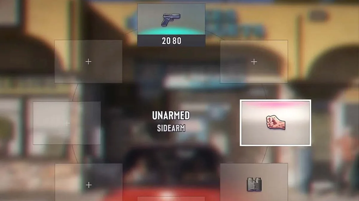
Days after the Extended Look, one element of GTA 6 divides the community: the UI. Fans argue the weapon wheel and minimap look 'too simple' and 'undercooked' for a 13-year project, while others defend the minimalist HUD as clean and functional. Rockstar has not commented — and history suggests the trailer UI usually ships unchanged.
The one thing fans can't agree on
The 26-minute Extended Look silenced most of the downgrade talk. But it opened a new front: the user interface. Days after the reveal, the debate is everywhere — Reddit, X, YouTube comments — and it splits the community almost down the middle (Kotaku).
The criticism targets two elements in particular. The weapon and item wheel, with its colorful flat icons for guns, melee weapons, healing items and clothing, is called "simple and boring" by some. The minimap draws the same complaints: "It took them 13 years to develop this game and you're telling me I have to have this basic UI," reads one popular Reddit comment relayed by Tech4Gamers. A post on the PC Master Race subreddit pointing out that many fans had defended the leak-era UI as "unfinished" racked up over 3,000 upvotes, with commenters joking that a game this expensive should not ship with such a bland interface (Kotaku).
"Undercooked" vs. "clean"
The harshest verdicts come from well-known GTA accounts. "Hot Take: GTA 6 needs to fix this simplistic UI," posted The GTA Assassin. "It lacks character, and looks undercooked. Rest of the game looks peak." Content creator Ben Videotech echoed the feeling about the weapon wheel: "I think they need to go back to the drawing board on this" (Kotaku).
Defenders are just as vocal. Many argue that a minimal HUD keeps the player focused on the action and that Rockstar has always favored sleek interfaces — Red Dead Redemption 2 being the exception. "I don't want to get distracted by it," one fan wrote. Others see the flat icons as "steam/indie-like" in the best way, and note that the design "matches the Vice City look" (Kotaku).
A familiar pattern
One detail complicates the optimistic take that Rockstar will overhaul the UI before November 19. Kotaku points out that when GTA V's first gameplay trailer showed its weapon wheel, the interface that shipped on Xbox 360 and PS3 was nearly identical — aside from a colored filter. Trailer UI, in other words, tends to be final UI. The Extended Look's interface was already visible in the 2022 leaks, and many fans assumed it would be redesigned by the official reveal; it was not (Tech4Gamers).
Rockstar has not commented on the criticism. Some players have started producing their own mockups — a version with rounded corners went viral, with most reactions admitting it looks more finished even if it doesn't solve everything (Kotaku). Chinese outlet 3DM has relayed the backlash under a blunt headline: the UI "doesn't look like a game developed over 13 years" (3DM).
What to make of it
The UI debate is a luxury problem: the rest of the game is being hailed as a technical landmark, so the interface becomes the weakest link by default. The honest answer is that we won't know what ships until November 19. But history, and the silence from Rockstar, suggest the minimalist HUD is more likely than not here to stay — for better or worse. GTA VI News will keep following the story.
Why it matters
For players counting down to November 19, 2026, this debate is a reminder that the version of GTA VI shown so far is close to what will ship on PS5 and Xbox Series X|S. If the trailer UI pattern holds, the weapon wheel and minimap seen in the Extended Look are likely representative of the final interface, so anyone hoping for a dramatic redesign may need to adjust expectations rather than wait for a reveal-day surprise.
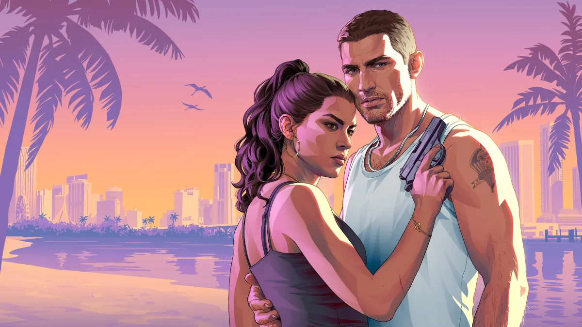
It also fits what Rockstar has already confirmed about the game. GTA VI is set in the fictional state of Leonida with Vice City as its main city, and follows Lucia and Jason — a grounded, modern setting where a clean HUD arguably matches the tone. Nothing about the UI controversy changes the release date, the platforms, or the core premise; it is a design argument, not a development delay.
FAQ
What is the GTA 6 UI controversy about?
Fans are split over the game's user interface shown in the Extended Look, particularly the weapon and item wheel and the minimap. Critics call the flat, colorful icons "undercooked" and lacking character, while defenders describe the HUD as clean, minimal, and true to the Vice City look.
When does GTA 6 release?
GTA VI releases on November 19, 2026, on PS5 and Xbox Series X|S. It is developed by Rockstar Games and published by Take-Two Interactive. Rockstar has not announced any change to that date.
Why do some fans think the UI will not change before launch?
They point to GTA V, whose first gameplay trailer showed a weapon wheel that shipped nearly unchanged on Xbox 360 and PS3. The GTA VI interface was also already visible in the 2022 leaks and reappeared in the official Extended Look, suggesting trailer UI tends to be final UI.
How has Rockstar responded to the UI criticism?
Rockstar has not commented on the criticism. Some players have responded by creating their own mockups, including a rounded-corner version that went viral, though most reactions admit it looks more finished without solving every complaint.